Introduction to Pxless Design
In modern web development, the way interfaces are designed is rapidly evolving. One of the most important shifts is the movement toward Pxless design, a philosophy that reduces dependence on fixed pixel-based measurements and encourages flexible, scalable layouts that adapt naturally to different devices and user preferences.
Traditional design systems rely heavily on fixed units such as pixels (px). While this approach offers control and precision, it often fails in today’s multi-device world, where screens range from small mobile phones to ultra-wide monitors. Pxless design addresses this limitation by prioritising relative, fluid and responsive units instead of rigid pixel values.
This approach is not just a trend; it is a response to the growing demand for accessibility, responsiveness, and user-friendly digital experiences.
Understanding Pxless Design
What Does Pxless Mean?
Pxless design refers to a development mindset where interfaces are created without relying strictly on pixel-based measurements. Instead of designing layouts with fixed dimensions, developers use scalable units such as percentages, relative font sizes, and viewport-based measurements.
The goal is simple: create interfaces that adjust themselves automatically, rather than forcing users’ screens to adapt to a fixed design.
Why Pixels Are Becoming Less Important
Pixels were once the standard because screens were more uniform. However, modern devices vary significantly in resolution, pixel density, and aspect ratio. A design that looks perfect on one screen may appear broken or misaligned on another.
Pxless design solves this issue by ensuring that layouts are flexible rather than fixed.
The Core Principles of Pxless Design
Fluid Layouts Instead of Fixed Grids
A central principle of Pxless design is the use of fluid layouts. Instead of defining elements with fixed widths like 300px or 800px, developers use proportional units such as percentages.
This ensures that:
- Content expands or shrinks based on screen size
- Layouts remain consistent across devices
- No horizontal scrolling is required
Fluid layouts are especially important for mobile-first development.
Relative Typography Scaling
Typography plays a major role in user experience. In Pxless design, font sizes are typically defined using relative units such as rem or em instead of fixed pixels.
This allows:
- Text to scale according to user preferences
- Better accessibility for visually impaired users
- Consistent readability across devices
For example, instead of setting a font size to 16px, a Pxless approach uses a scalable unit that adapts based on the root font size.
Viewport-Based Responsiveness
Another key principle is the use of viewport units like vw and vh. These units are based on the size of the user’s screen.
This allows designers to:
- Create full-screen sections that adapt automatically
- Build responsive hero banners
- Maintain consistent spacing regardless of device
Viewport-based design ensures that layouts feel natural on both small and large screens.
Benefits of Pxless Design
Improved Accessibility
One of the strongest advantages of Pxless design is accessibility. Users can adjust browser settings such as zoom or default font size, and Pxless layouts will adapt accordingly.
This is particularly important for users with:
- Visual impairments
- Reading difficulties
- Older devices with scaling needs
A Pxless approach ensures content remains readable and usable for everyone.
Better Responsiveness Across Devices
With the wide variety of screen sizes available today, responsiveness is essential. Pxless design ensures that interfaces automatically adjust to:
- Smartphones
- Tablets
- Laptops
- Large desktop monitors
- High-resolution displays
This eliminates the need for multiple fixed layouts.
Easier Maintenance for Developers
Pxless systems are often easier to maintain in the long run. Instead of adjusting multiple fixed values for different breakpoints, developers work with flexible rules that adapt automatically.
This reduces:
- Code duplication
- Responsive bugs
- Time spent on manual adjustments
Future-Proof Design Systems
Technology continues to evolve rapidly. New devices with unconventional screen sizes are constantly being released. Pxless design helps ensure that websites remain compatible with future devices without major redesigns.
Challenges of Pxless Design
Learning Curve for Developers
For developers used to pixel-perfect design, switching to Pxless systems can be challenging. It requires a different mindset focused on flexibility rather than strict control.
Less Predictable Layouts
Because Pxless design is fluid, layouts may sometimes behave unpredictably if not carefully structured. Without proper planning, elements can shift in unintended ways.
Requires Strong Design Systems
Pxless design works best when supported by a well-structured design system. Without consistent rules for spacing, typography, and layout, the flexibility can lead to inconsistency.
Pxless vs Pixel-Based Design
Traditional Pixel-Based Approach
Pixel-based design focuses on precision. Every element is assigned a fixed value, such as:
- Width: 400px
- Font size: 16px
- Margin: 20px
This approach works well for static layouts but struggles with responsiveness.
Pxless Approach
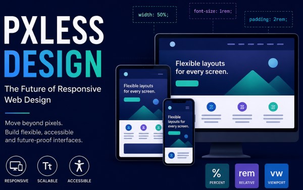
Pxless design replaces fixed values with scalable units:
- Width: 50%
- Font size: 1rem
- Margin: relative spacing units
This creates a flexible system that adapts to any screen size.
Key Difference
The main difference is control versus flexibility:
- Pixel-based design = rigid and precise
- Pxless design = fluid and adaptive
How Pxless Design Improves User Experience
Consistent Experience Across Devices
Users expect websites to look and function properly regardless of the device they are using. Pxless design ensures consistency by adapting layouts dynamically.
Reduced Frustration for Users
Fixed layouts often cause issues such as:
- Overlapping elements
- Tiny unreadable text
- Horizontal scrolling
Pxless design eliminates these problems by adjusting automatically.
More Natural Interaction
Pxless interfaces feel more natural because they behave like fluid systems rather than rigid structures. Content flows smoothly based on available space.
Best Practices for Pxless Design
Use Relative Units Wherever Possible
Instead of pixels, use:
- rem for typography
- % for layout widths
- vw and vh for responsive scaling
Design Mobile-First
Start designing for small screens first, then scale upwards. This ensures core content remains accessible on all devices.
Maintain Consistent Spacing System
Use a structured spacing system so that elements remain visually balanced across all screen sizes.
Test Across Multiple Devices
Always test layouts on different screen sizes to ensure responsiveness works as intended.
The Future of Pxless Design
Pxless design represents a broader shift in web development towards flexibility and adaptability. As devices continue to diversify, rigid design systems will become less effective.
Future design systems are likely to:
- Rely even more on relative units
- Integrate AI-driven responsiveness
- Focus heavily on accessibility
- Remove dependency on fixed measurements entirely
This evolution will make digital experiences more inclusive and user-friendly.
Conclusion
Pxless design is more than just a technical adjustment; it is a fundamental shift in how we approach digital interfaces. By moving away from rigid pixel-based systems and embracing flexible, scalable units, developers can create websites that are more responsive, accessible, and future-proof.
While it requires a change in mindset and careful planning, the benefits far outweigh the challenges. Pxless design ensures that digital content remains usable and visually consistent across all devices, making it an essential approach for modern web development.